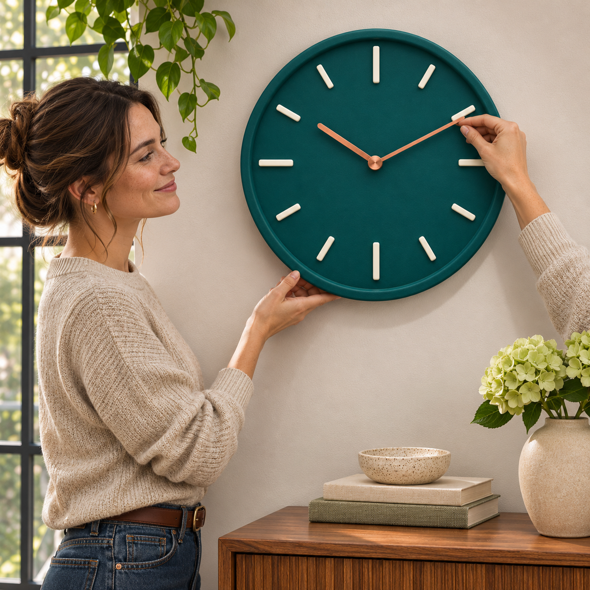
Verdant Hour Deep Teal Round Wall Clock with Raised Cream Hour Markers, Copper-Tone Hands & Matching Circular Rim
Verdant Hour Deep Teal Round Wall Clock with Raised Cream Hour Markers, Copper-Tone Hands & Matching Circular Rim
📢Try it now and if it doesn't work, we guarantee a full refund!
✅ Made in the UK
✅ 90-day money-back guarantee
✅ Natural ingredients for fast, long-lasting results
✅ Long-standing service to the London Early Years Foundation
⚡ Stock is limited and will sell out soon!
Couldn't load pickup availability
VERDANT HOUR · TIME, FRAMED IN COLOR
🕰️ A Wall Can Tell More Than the Time.
It can set the mood of a room. Bring a favorite color into view. Give a quiet corner a point of focus. Verdant Hour brings those possibilities together in a round wall clock with a rich deep-teal face, creamy raised markers, and warm copper-tone hands.
The design is deliberately uncluttered. No ring of printed numbers, no decorative lettering across the center. Just a circular field of color, twelve distinct hour markers, and two hands meeting at a matching warm-toned hub.
It is a familiar object with a more expressive palette: practical in purpose, graphic in appearance, and easy to imagine as part of a room you enjoy spending time in.

🎨 The Palette Is the Personality
The first impression is the color. Deep teal sits between a botanical green and a blue-toned jewel shade, giving the face a rich appearance without relying on a busy pattern. The matching outer rim keeps the circular outline coherent, allowing the lighter details to stand out within it.
The cream markers bring a softer contrast than stark white. Their rounded ends complement the clock's circular form, while their raised appearance adds visible depth. At the center, the copper-tone hands introduce a warmer note, creating a small but distinctive change in color.
Together, the three tones offer a ready-made decorating direction. You can draw on the green for foliage and textiles, the cream for walls and ceramics, and the warm metallic appearance for a few carefully chosen accents.
Three Details That Give the Face Its Character
A continuous circular border
The raised-looking rim surrounds the dial in the same deep color. It gives the face a defined edge and an almost tray-like visual profile, containing the arrangement without introducing a second frame color.
A rhythm of cream markers
Twelve pale bars mark the hours, with longer markers at the four main positions. Their spacing creates a balanced rhythm around the dial, keeping the display visually simple rather than filling it with numerals.
A warm-toned focal point
The two slender hands and circular center hub have a copper-colored appearance. Against the dark face, they become a fine, contrasting detail rather than another large block of color.
🌱 Let the Wall Breathe Around It
A strong color often looks best when it has a little space. Try Verdant Hour against a pale wall, where the outer circle can read clearly and the teal face becomes a distinct shape in the room.
For a console-table arrangement, consider what sits below as well as what hangs above. A low bowl, a few books, or one vase can create a pleasing relationship with the clock without competing for attention. Leave enough separation between the objects so the wall does not feel crowded.
If you prefer a gallery wall, use the clock as one of the larger visual anchors. Repeating a small amount of its cream or copper-tone palette in nearby pieces can make the collection feel related without making every item match.

☕ Small Moments, a Different View
The first cup of the morning. A pause between chapters. That glance across the room before you leave for the day. A wall clock belongs to these ordinary moments, and its appearance becomes part of the backdrop to them.
Imagine a warm neutral room with a little greenery near the window. Verdant Hour adds a deeper shade above a cabinet, bringing the palette together without another stack of objects on the surface below.
It does not need an elaborate setting. A clear patch of wall and a thoughtful relationship to the furniture can be enough. Sometimes the finishing touch is simply the right shape in the right color.
Choose the Setting That Suits Your Day
In the living area: Let the teal circle bring definition to a neutral scheme. Consider the view from your usual seat, making sure the clock's size and hand contrast work at that distance.
Above an entryway console: Use the circular shape to soften the straight lines of a cabinet. Position it where it remains visible without interfering with hooks, shelving, or the movement of a nearby door.
Near a work corner: Introduce color without adding another object to the desk. Check the angle from your chair and the lighting at different times of day before selecting the mounting position.
Within a reading nook: Pair the rich face with muted upholstery and warm textures for a cohesive look. If operating sound matters in your chosen room, confirm the movement's noise specification before ordering.
📍 A Good Position Makes the Difference
- Start with the actual diameter. Compare the verified product measurement with your wall space rather than judging scale from a lifestyle photograph.
- Test the view. Consider both viewing distance and angle, especially because the dial uses markers instead of printed numbers.
- Check the light. Choose a position where the hands and markers remain clear under your usual room lighting.
- Plan the mounting. Confirm the rear fitting, product weight, wall type, and suitable fixings before installation.
- Leave access. Follow the instructions for setting the time and accessing the power source, if applicable.

A Simpler Face, Not a Plainer One
Removing printed numbers lets the smaller details become more noticeable. The contrast between the teal face and cream bars. The rounded ends of the markers. The fine lines of the hands and the warm highlight at the center.
From across the room, the clock has a strong graphic identity. Closer up, the raised details give the arrangement more dimension. That change in perspective is part of its appeal: a simple circle at first glance, a considered combination of shapes when you look again.
Pair it with understated furnishings for a restrained look, or use it as a deeper color note among softer pastels. The design offers enough personality to stand alone, while its limited palette leaves room for your own decorating choices.
🔎 The Details to Confirm Before Ordering
The photographs establish the deep teal appearance, matching circular rim, twelve raised cream markers, and two copper-tone hands. Copper-tone describes the visible color, not a verified solid-copper composition.
Exact materials, dimensions, weight, movement type, timekeeping tolerance, power requirements, and package contents need confirmation from the product specifications. Silent operation, a sweeping movement, illuminated markers, and included batteries or mounting hardware are not claimed here.
Follow the supplied guidance for installation, setting, and cleaning. Do not force the hands or assume they should be adjusted directly because a lifestyle image shows a hand near the dial. Furniture, plants, books, ceramics, and other styling accessories pictured are not represented as included.
A RICHER COLOR FOR THE EVERYDAY
✨ Make Time Part of the Room.
A deep teal circle, creamy hour markers, and a warm copper-tone accent at the center. Verdant Hour turns a familiar wall clock into a distinctive piece of your interior palette.
Find its place, give it room, and let a simple everyday object bring more character to the wall.

Verdant Hour Deep Teal Round Wall Clock with Raised Cream Hour Markers, Copper-Tone Hands & Matching Circular Rim